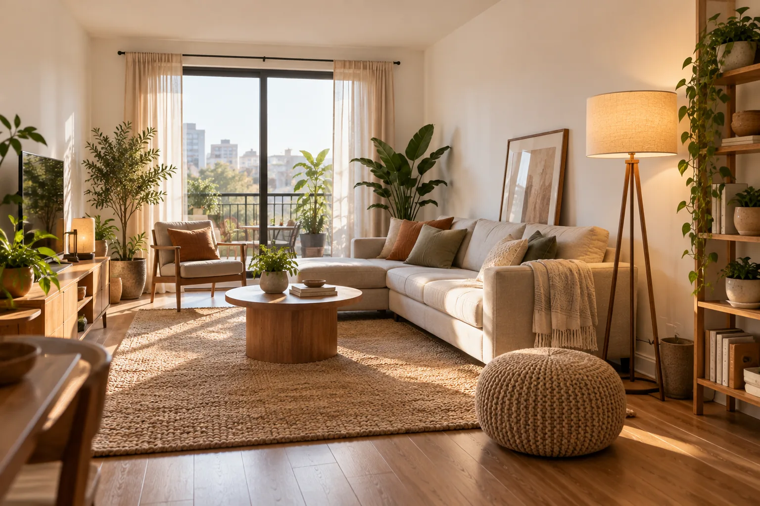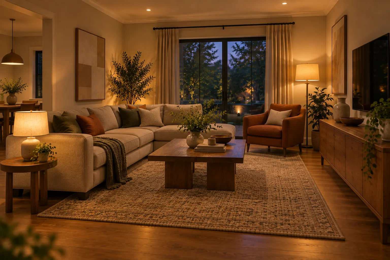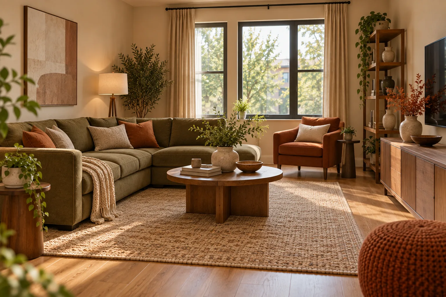
How to Mix Wood Tones Without It Looking Chaotic
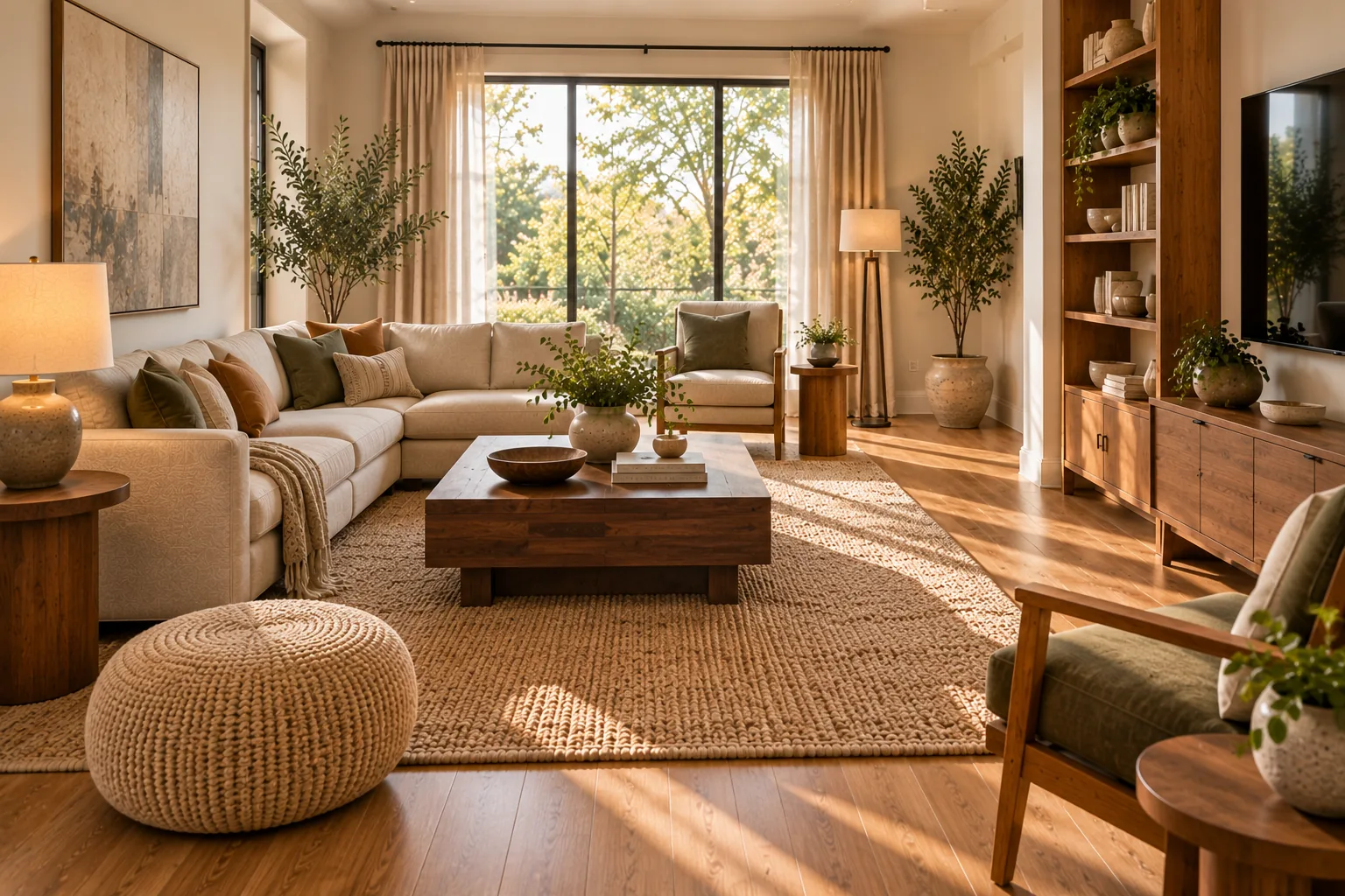
A real system for mixing wood tones — undertone over shade, one anchor tone, and neutral buffers for near-misses — not just "it's fine to mix."
Every room with more than one wood furniture piece in it faces the same unspoken question: does this look intentional, or does it look like the furniture arrived from three different decades by accident.
Most advice on the subject stops at "it's fine to mix wood tones," which is true but not especially useful without a way to actually judge whether two particular pieces belong in the same room. Paint colors come with names, swatches and a clear system for matching. Wood doesn't — it varies continuously in tone, and the real skill isn't avoiding mixed wood tones, it's knowing which combinations read as considered and which read as accidental.
Why Mixing Wood Feels Riskier Than Mixing Almost Anything Else
A paint chip tells you exactly what you're getting. A "medium oak" dresser from one retailer and a "medium oak" table from another can look noticeably different sitting next to each other, because wood tone depends on the species, the stain, the finish sheen, and the light hitting it, not a single standardized value. That's what makes mixing wood tones feel riskier than mixing fabrics or metals — there's no shared naming system to lean on, so most people either avoid mixing entirely or do it without a real method and hope for the best.
Warm Undertones vs. Cool Undertones
Every wood tone leans warm or cool, independent of how light or dark it is. Warm undertones carry red, orange or yellow — honey oak, cherry, mahogany, most reclaimed and rustic finishes. Cool undertones carry grey, ash or muted brown with little red or yellow in it — whitewashed oak, ash grey finishes, some modern walnut stains that lean grey rather than red.
This distinction matters more than lightness or darkness. A light warm oak and a dark warm walnut can sit comfortably in the same room because they share an undertone, even though they're nowhere close in shade. Two medium-toned woods that are almost identical in lightness can clash badly if one leans warm and the other leans cool — the mismatch reads as slightly wrong even to someone who couldn't explain why.
The Anchor Tone Method
Rather than trying to coordinate every wood surface in a room at once, pick one anchor: usually whichever wood tone covers the most visual area, which is often the floor, sometimes a large piece like a bed frame or dining table. Every other wood tone in the room gets chosen in relation to that anchor — same undertone family, and ideally either noticeably lighter or noticeably darker rather than a near-miss on the same shade.
This is also why floors matter more than most people account for when buying furniture. A warm honey-toned hardwood floor sets the undertone for the entire room whether or not you've thought about it, and furniture chosen without reference to it can clash even if it looks fine in isolation.
Use a Neutral Buffer Between Tones That Don't Quite Get Along
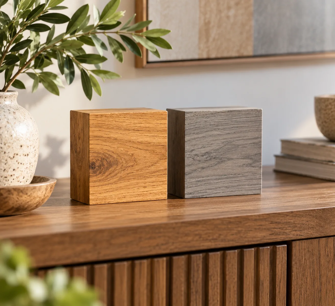
Two wood tones that are close enough to almost match, but not quite, are harder to place together than two tones that are clearly different. A rug, a painted surface, upholstery, or metal hardware placed between two wood pieces gives the eye a break and stops the near-miss from reading as a mistake. This is a more reliable fix than trying to find a third wood tone that bridges the gap perfectly, which is difficult to do by eye and easy to get wrong.
How to Actually Test Undertone at Home
The most reliable low-effort test: look at the piece in natural daylight, away from any warm incandescent or yellow-toned bulb, which can push even a cool-toned wood to look warmer than it is. Hold a plain white sheet of paper next to the wood — if the wood looks pink, orange or yellow against the white, it's warm; if it looks grey, taupe or slightly purple-brown, it's cool. This takes under a minute and is far more reliable than judging tone from memory or a product photo, where white balance and lighting are rarely neutral.
It's also worth testing at the specific time of day the room gets the most use. A north-facing room with cool, indirect daylight will make wood tones read cooler than the same pieces would in a west-facing room with warm afternoon light. The "right" pairing in one room isn't automatically right in another, even with identical furniture.
Coordinating Metal Finishes With Your Wood Tones
Hardware and fixtures interact with wood undertone the same way a second wood tone would. Brass and warm gold tones generally pair more naturally with warm wood undertones, while chrome, matte black and cool brushed nickel sit more comfortably with cool-toned wood. This isn't an absolute rule — matte black against warm walnut is a common and effective contrast pairing — but an unplanned mix of warm wood, cool hardware, and a third undertone in the light fixtures is a common way rooms end up feeling subtly uncoordinated without an obvious single cause.
Real Examples
The Small Apartment With Mismatched Furniture
A common starting point: a warm oak dresser from one source, a cooler-toned grey oak desk from another, neither of which was bought with the other in mind. Replacing either piece is rarely the first move worth making. A rug or textile in a color that reads neutral against both tones, placed between them or under the piece that clashes more, usually resolves the mismatch for the cost of one accessory instead of two pieces of furniture.
The Family Home With Multiple Wood-Heavy Rooms
In an open-plan home where flooring runs continuously between the kitchen, dining and living areas, that floor is doing the anchor-tone job for the whole space whether you've planned for it or not. Furniture bought room by room, without reference to that shared floor, is the most common reason an open-plan home ends up feeling visually disjointed even when each individual room looks fine on its own.
The Rental With Existing Flooring You Can't Change
Renters usually don't get a vote on flooring, which makes it the fixed anchor tone by default. Rather than fighting the floor's undertone, choosing furniture that matches or intentionally contrasts with it — rather than landing in the ambiguous near-miss zone — is the more reliable path, since refinishing or replacing the floor isn't on the table.
Grain and Visual Weight Matter Alongside Tone
Two woods can share an undertone and still feel mismatched if their grain patterns are dramatically different in scale. A tight, subtle grain like maple next to a bold, open grain like oak can look intentional as a contrast, or can look like an oversight, depending on how much else in the room is competing for attention. As a general rule, if the room already has a lot of visual texture — patterned textiles, varied art, an active rug — keeping the wood grain pairings calmer and more similar in scale gives the eye a place to rest. In a simpler, more minimal room, a bolder grain contrast has more room to read as a deliberate design choice rather than noise.
Common Mistakes
Mistake: Judging tone match in the store, not in your own room. Retail lighting is frequently cooler or warmer than home lighting, which can make two pieces look like they match in the showroom and clash once they're both sitting in your actual room. When possible, bring a sample or photo from your space rather than trusting memory or store lighting.
Mistake: Mixing more than three wood tones in one room. Two or three distinct wood tones read as a considered palette. Four or more, especially without a clear anchor, starts to read as unplanned regardless of how well any two of them individually pair.
Mistake: Forgetting the floor counts as a wood tone. Furniture is often chosen in isolation from flooring, as if the floor were a neutral backdrop rather than the largest wood surface in the room. It isn't neutral, and it usually needs to be treated as the anchor rather than an afterthought.
Mistake: Assuming the same species means the same tone. Two pieces of oak, or two pieces of walnut, can be stained in completely different directions. Species is a much weaker predictor of whether two pieces will pair well than the actual undertone of the finish in front of you.
A Simple Wood-Tone Checklist
- What's the largest wood surface in the room, and what undertone does it lean?
- Does each other wood piece share that undertone, or clearly contrast with it?
- Are there more than three distinct wood tones in the room?
- Is there a neutral buffer (rug, paint, textile, metal) between any two tones that are a near-miss?
- Did you check the pairing in your own room's light, not the store's?
Budget-Friendly Ways to Fix a Wood-Tone Mismatch
Refinishing a single piece to shift its undertone is usually far less expensive than replacing it, and doesn't require matching a discontinued finish. Where refinishing isn't practical, a runner, rug or piece of art placed strategically between two clashing pieces solves the visual problem without touching the furniture itself. This matters most in a home built around warm, natural materials, where wood tone consistency does more work than almost any other single decision to make a room feel cohesive rather than assembled piece by piece.
You Don't Need Matching Wood. You Need a System
Mixing wood tones successfully isn't about finding pieces that match — it's about identifying an anchor tone, respecting undertone over shade, and giving any near-miss pairing a neutral buffer to separate them. Once that system is in place, wood tones that would otherwise clash tend to resolve themselves. This is really just one application of a broader idea covered in the interior design principles that make a home feel more beautiful: repetition and intentional contrast, applied consistently, do more for a room than any single perfect match.
Is it OK to mix light and dark wood in the same room?
Yes, and it's often easier to get right than mixing two similar mid-tones, as long as both share the same warm or cool undertone. The contrast in lightness reads as intentional when the undertone is consistent.
How many different wood tones should one room have?
Two to three is the practical ceiling. Beyond that, even well-matched individual pairings start to read as visually busy rather than layered.
Does the floor count as one of the wood tones I need to match?
Yes, and it's usually the most important one to account for, since it typically covers more visual area than any single piece of furniture and sets the undertone for the whole room.
What's the fastest fix for two wood pieces that don't match?
Add a neutral buffer between them — a rug, a textile, or a piece of art — rather than replacing either piece. It's the lowest-cost fix and works for most near-miss mismatches.
Can I mix wood tones in a rental with flooring I can't change?
Yes. Treat the existing floor as your fixed anchor tone and choose furniture that either matches its undertone or intentionally contrasts with it, rather than landing in the ambiguous middle ground.