25 Interior Design Principles That Make Any Home Feel More Beautiful
The style-agnostic fundamentals — scale, balance, focal points, contrast — behind every home that feels effortlessly beautiful.
Trends come and go. Good design principles don't.
It's easy to mistake decorating for design — buying the right pieces in the right colors. But the homes that feel effortlessly beautiful, year after year, are almost always built on a handful of underlying principles that have nothing to do with any particular style or trend.
These 25 principles apply whether your home is minimalist or maximalist, traditional or modern. Here's what actually makes a home feel beautiful, on a level deeper than any single decorating choice.
1. Scale and Proportion Matter More Than Style
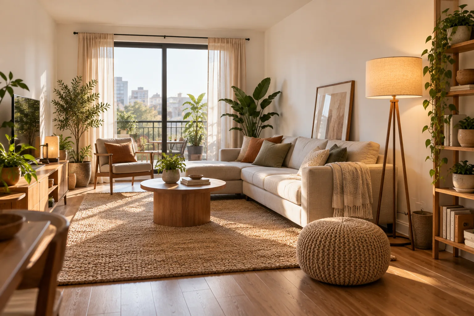
A room can follow every trend perfectly and still feel wrong if the furniture is the wrong size for the space. Before choosing a style, get the scale right — furniture, rugs and art all sized appropriately for the room they're in. Proportion is what makes a room feel right before you've even registered why.
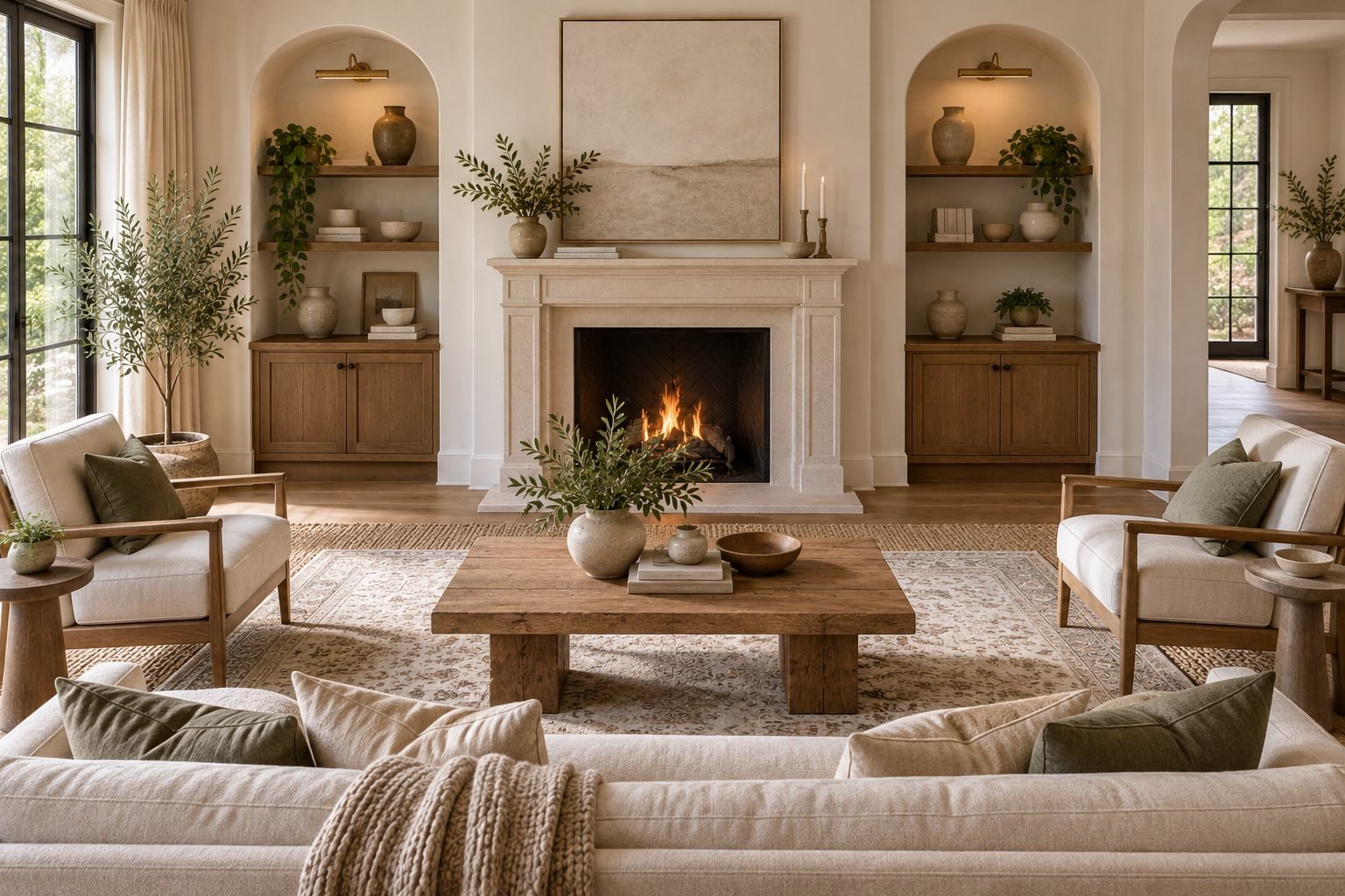
2. Establish a Focal Point in Every Room
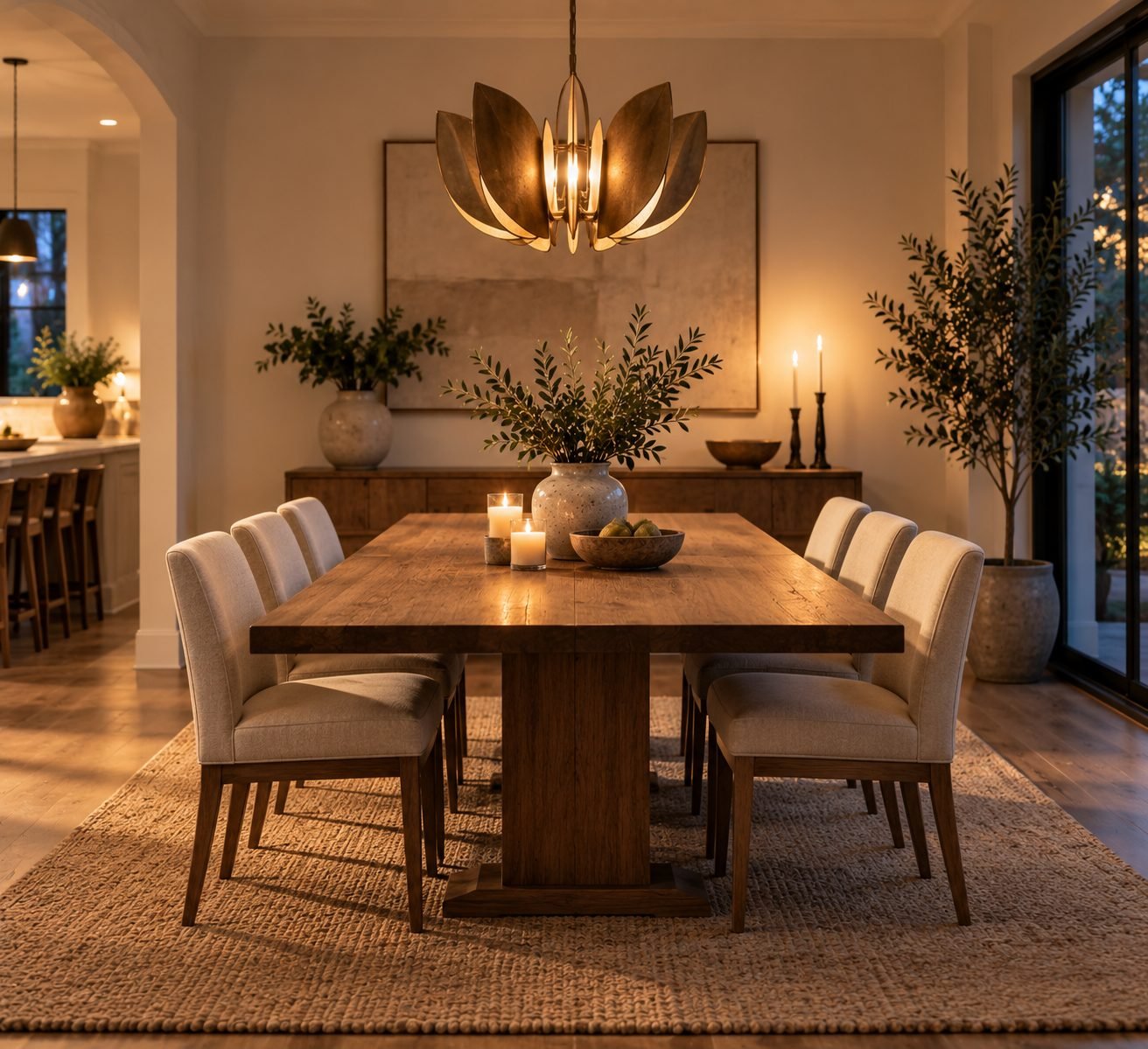
A room without a clear focal point — a fireplace, a piece of art, a striking light fixture — leaves the eye with nowhere to land. Establishing one, and arranging everything else to support rather than compete with it, gives a room immediate structure.
3. Create Visual Balance, Symmetrical or Not
Balance doesn't require mirror-image symmetry. A large sofa on one side of a room can be balanced by a grouping of two smaller chairs and a floor lamp on the other — different elements, similar visual weight. The goal is that no single side of a room feels heavier than the other.
4. Use the Rule of Three
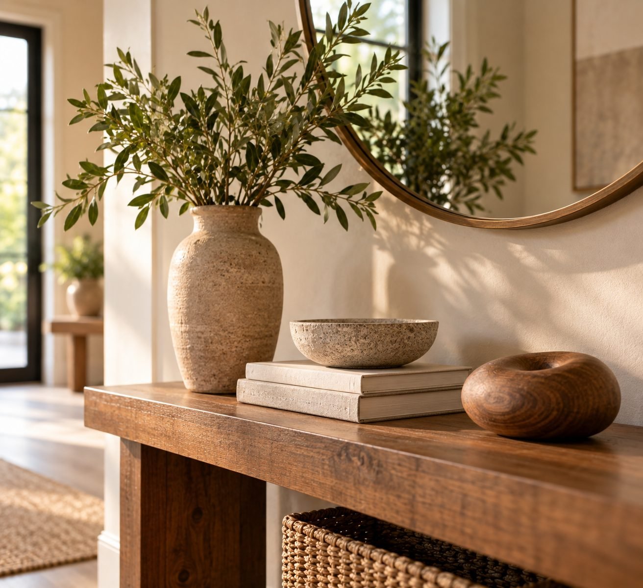
Groupings of three, with varying height, read as intentional in a way that pairs or single objects rarely do. It's one of the oldest rules in design because it consistently works, on a shelf, a mantel, or a console table.
5. Vary Height to Create Rhythm
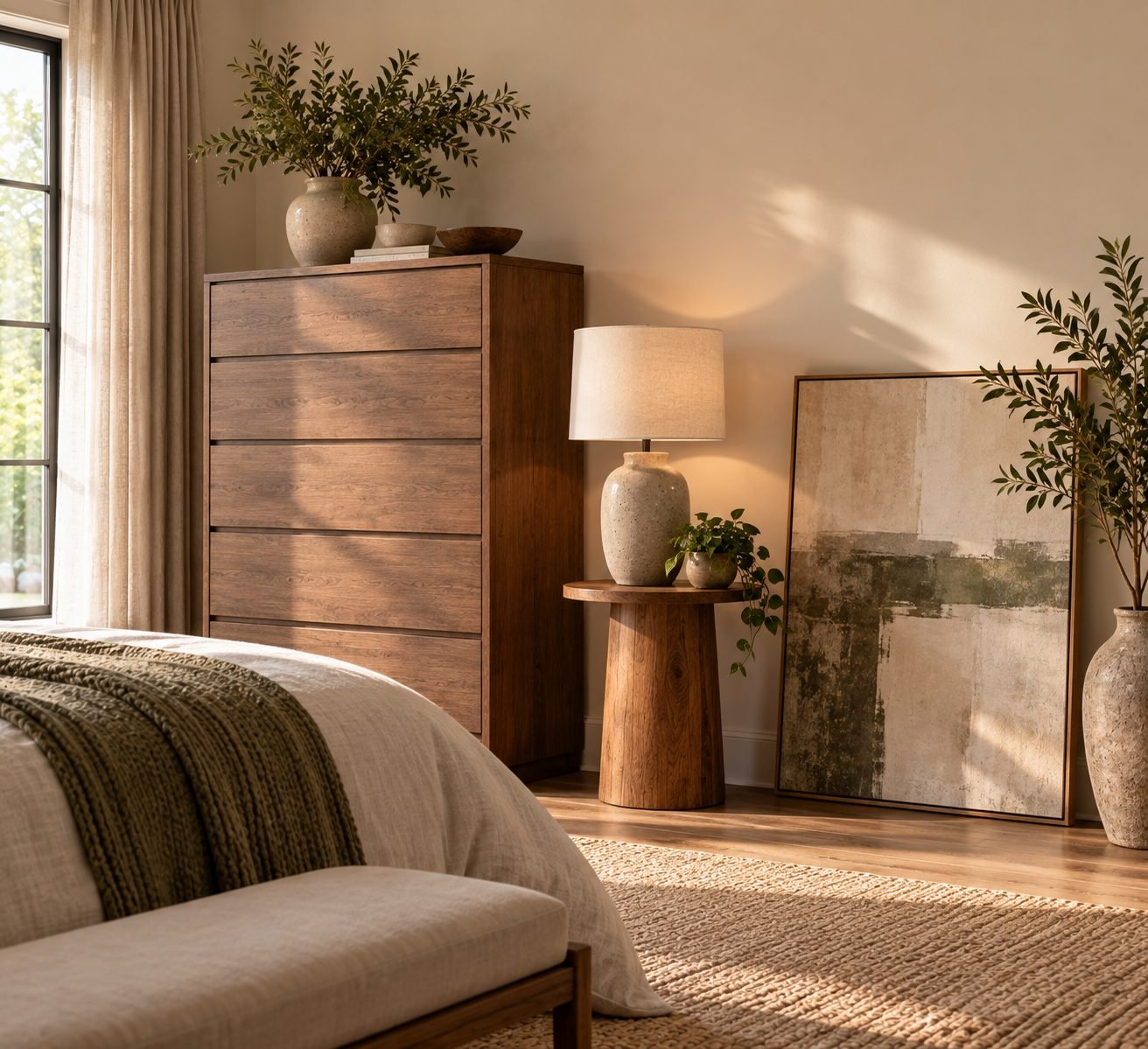
A room where everything sits at the same height — all furniture, all art at one line — reads as flat no matter how nice the individual pieces are. Deliberately varying height across a room creates visual rhythm the eye can follow.
6. Repeat Elements to Create Unity
A color, a material, or a shape repeated at least three times throughout a room (or a home) ties everything together, even when the individual pieces come from completely different sources and eras.
7. Use Contrast Deliberately
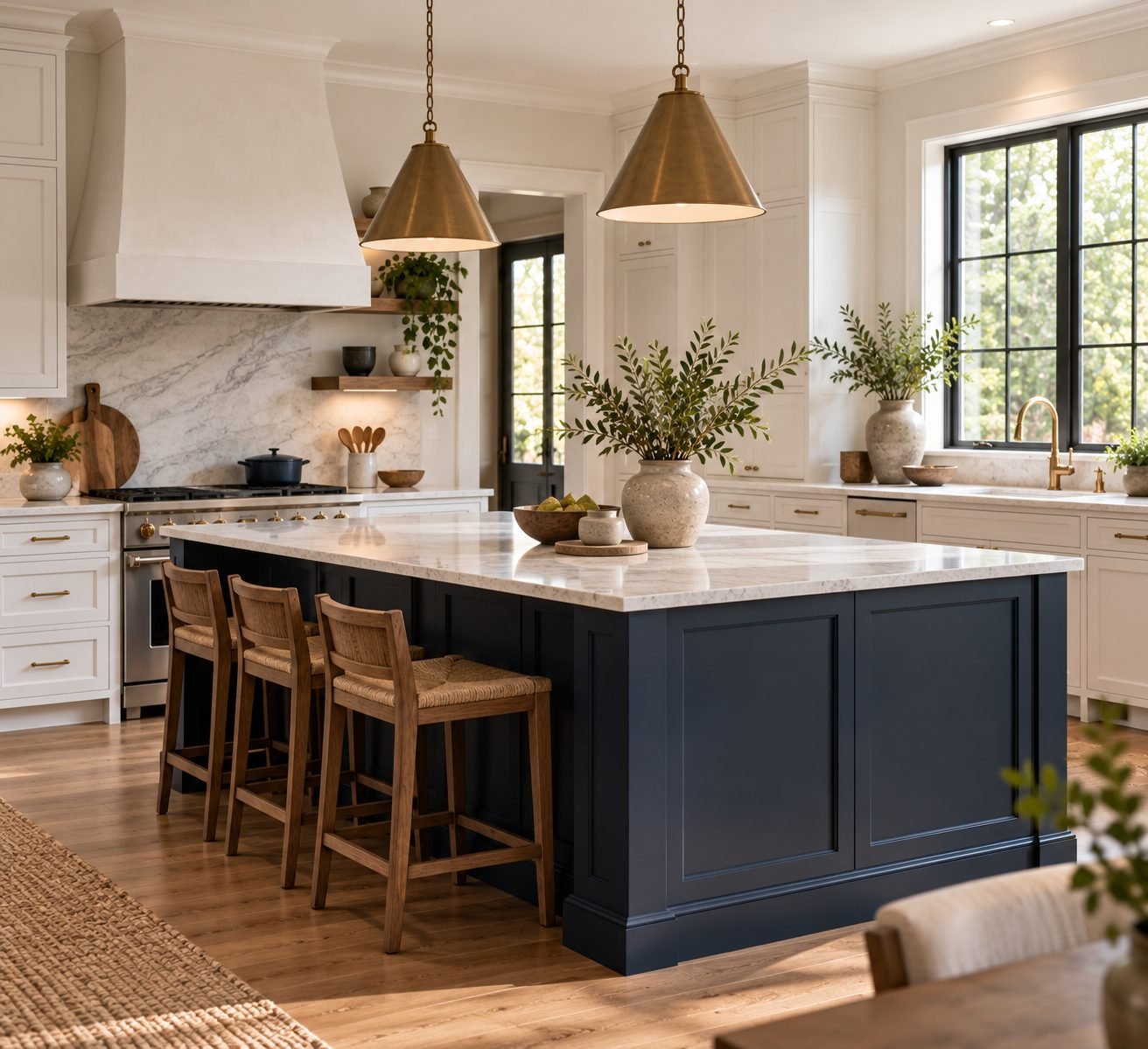
Contrast — dark against light, rough against smooth, old against new — is what keeps a room from feeling monotonous. Used deliberately in one or two places, rather than scattered everywhere, it reads as a considered design choice instead of visual noise.
8. Respect Negative Space
Not every wall needs art. Not every surface needs an object. Empty space gives the eye somewhere to rest and makes the furnished areas of a room feel more intentional by comparison. A room that's completely full, wall to wall, rarely feels calm.
9. Let Function Inform Form
A beautiful chair nobody can comfortably sit in, or a coffee table too fragile to actually use, undermines a room no matter how well it photographs. The most enduringly beautiful design solves a real problem first and looks good as a result, not the other way around.
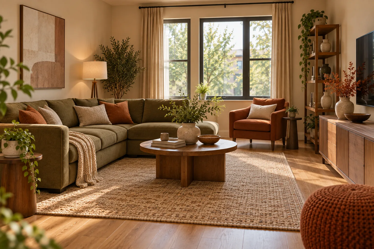
10. Choose a Consistent Color Story
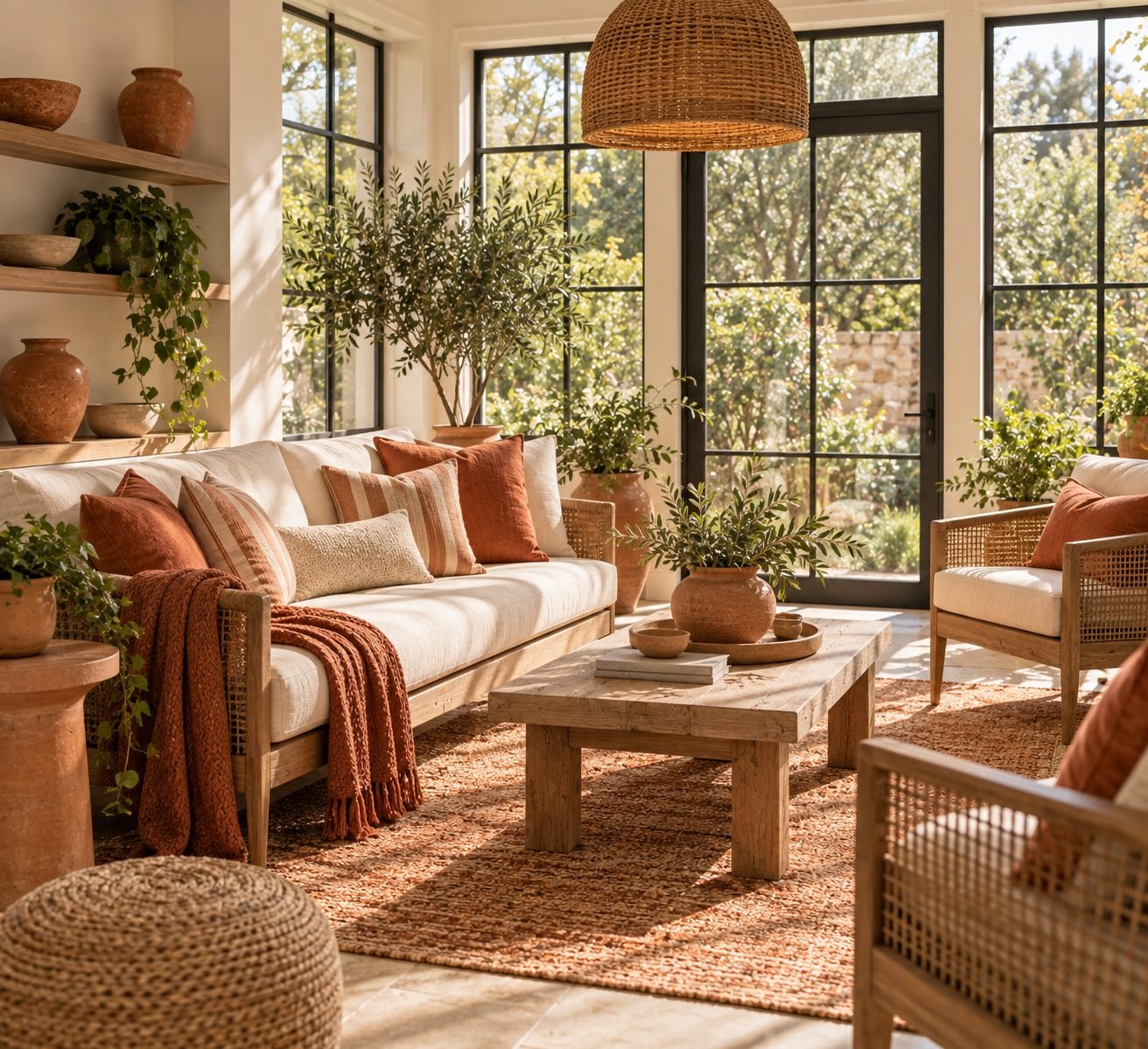
A room doesn't need to be monochromatic to feel cohesive, but it does benefit from a defined story — two or three colors that show up deliberately across furniture, textiles and accessories, rather than one of everything in a different shade.
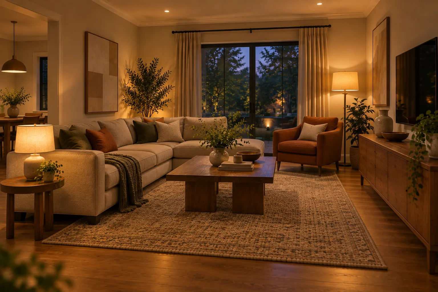
11. Layer Lighting for Depth
A room lit only by one overhead source will always feel flatter than one with ambient, task and accent lighting working together. Layered light creates depth the way layered furniture heights do — it gives the eye more to read.
12. Consider Sightlines Between Rooms
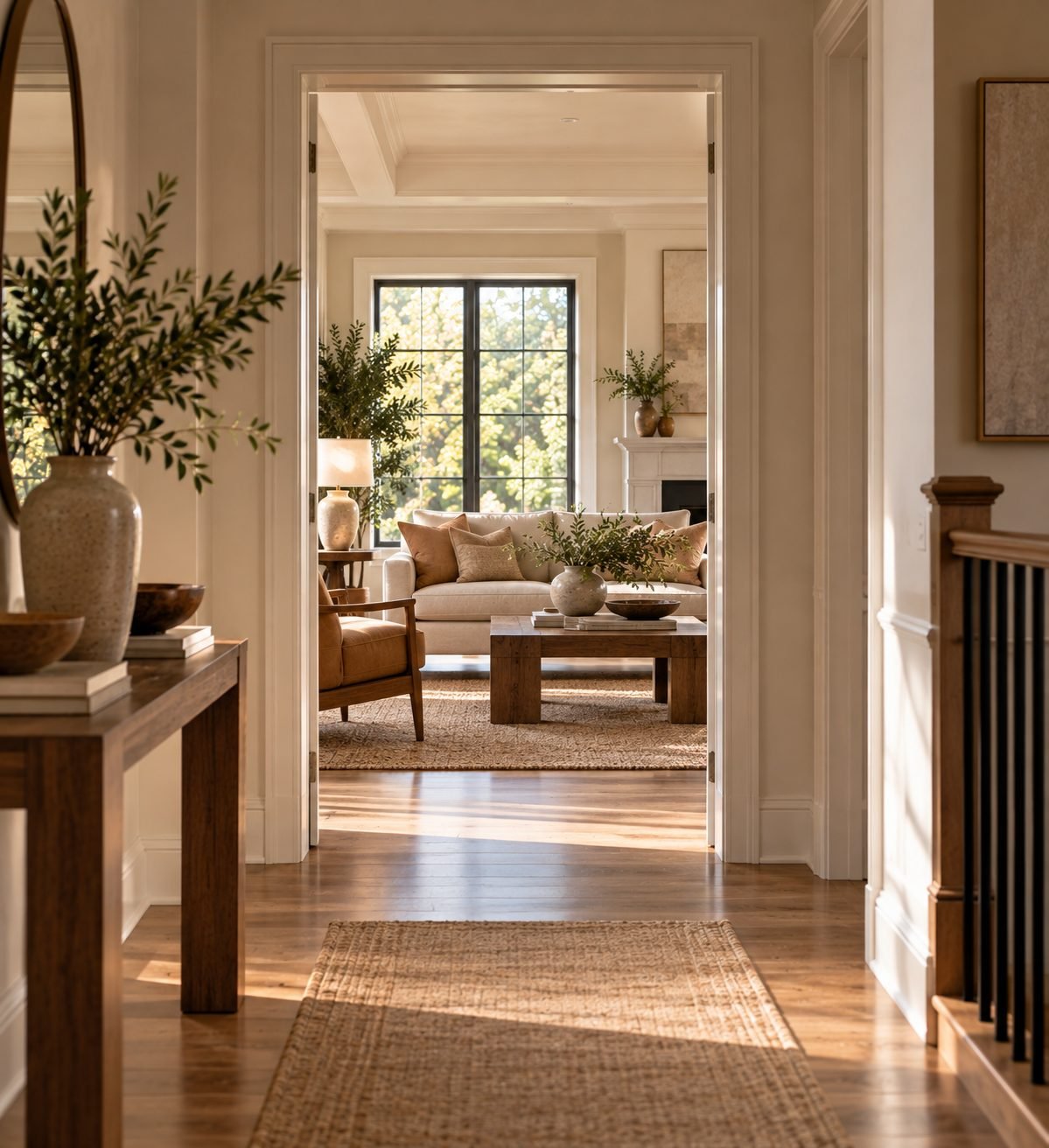
What you see from a hallway, a front door, or an adjacent room is part of that room's design, whether you plan for it or not. A beautiful living room loses some of its impact if the view into it is cluttered or awkward. Consider what's framed in each doorway, not just each room in isolation.
13. Scale Art to the Wall and Furniture Below It
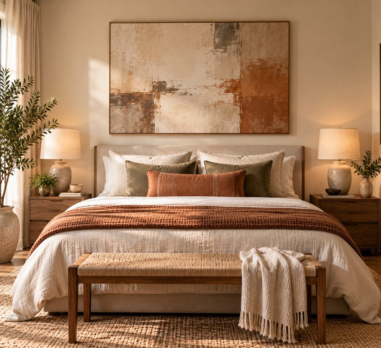
Undersized art is one of the most common and most fixable design mistakes. As a general rule, art (or a grouped arrangement) should span roughly two-thirds of the furniture width beneath it, not float in isolation on a large wall.
14. Use Texture to Add Depth Without Color
A room that stays in one tight color range can still feel rich if the materials vary — linen, wool, wood grain, stone, ceramic. Texture is often the difference between a neutral room that feels flat and one that feels layered.
15. Anchor Furniture With a Properly Sized Rug
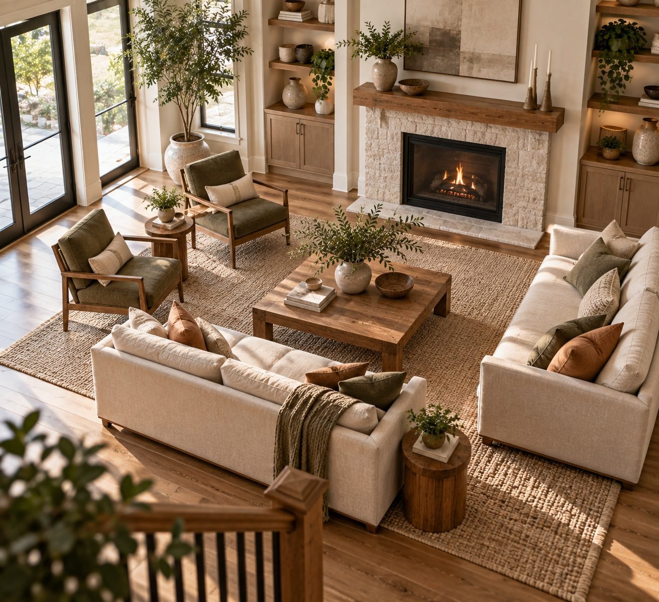
An undersized rug is one of the fastest ways to make a well-furnished room feel disjointed. As a rule, at minimum the front legs of every seating piece should rest on the rug — ideally all four legs do — so the rug reads as an anchor, not an afterthought.
16. Create Flow Between Adjacent Rooms
Open-concept or not, adjacent rooms should feel like they belong to the same home — through a shared color family, consistent flooring, or repeated materials — even if their individual functions and furniture are completely different.
17. Design for How a Room Is Actually Used
A formal living room nobody sits in because the "real" gathering happens in the kitchen isn't succeeding as design, regardless of how it looks. Observe how a space actually gets used before finalizing its layout, not just how you imagine it should be used.
18. Use the 60-30-10 Color Rule
A reliable starting formula: roughly 60% of a room in a dominant color (often walls and large furniture), 30% in a secondary color, and 10% in an accent. It's a simple ratio, but it prevents the common mistake of giving every color equal weight.
19. Let Architecture Guide the Design, Not Fight It
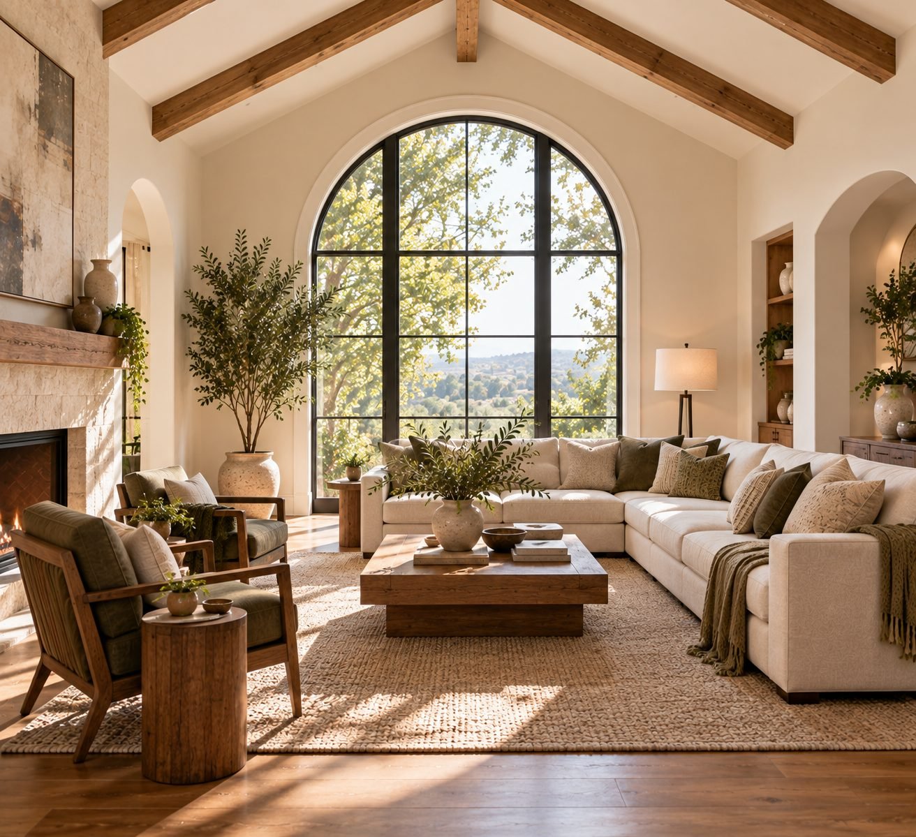
A home's existing architectural features — beams, arches, moldings, an unusual window — are a head start, not an obstacle. Design that works with those features tends to feel more resolved than design that tries to hide or override them.
20. Edit Ruthlessly
Nearly every design problem responds better to removing something than adding something. Before buying a new piece to fix a room that feels off, try removing one or two existing items first and see how the room reads.
21. Consider the View From the Doorway
The first thing you see when entering a room sets the tone for how the whole space is perceived. Arrange the most considered elements — the focal point, the best furniture grouping — to be visible from the entry, not tucked in a corner you only discover later.
22. Mix High and Low
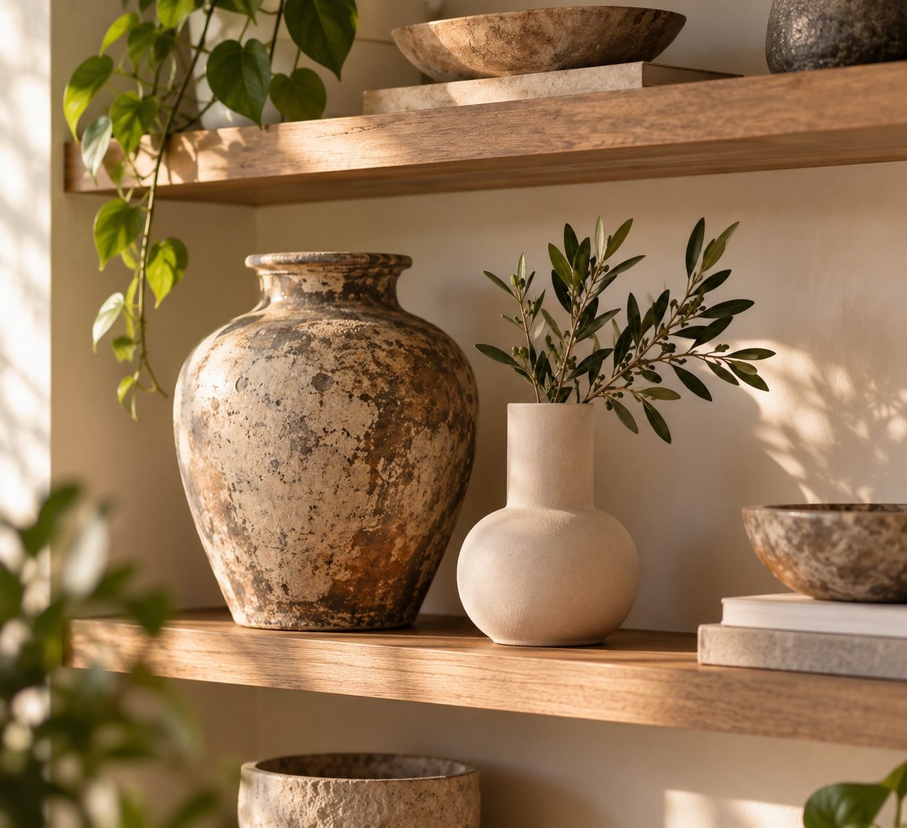
A room furnished entirely from one price point, high or low, tends to feel one-note. Mixing an investment piece with something simple and affordable usually reads as more interesting, and more personal, than an all-matching approach.
23. Design in Layers, Not All at Once
The best-feeling homes are rarely furnished completely in a single trip. Layering in pieces over time — a vintage find here, a considered splurge there — naturally produces the mixed, collected feeling that's difficult to manufacture by buying everything at once.
24. Trust Proportion Over Trend
Trends specify colors and shapes; proportion is closer to physics. A well-proportioned room designed a decade ago often still looks right today, while a trend-driven room can feel dated within a few years. When in doubt, prioritize scale and proportion over whatever's currently popular.
25. Let a Home Evolve
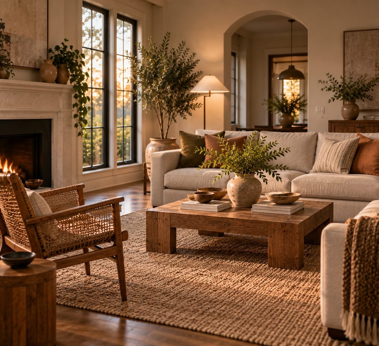
A home finished all at once, and never touched again, tends to feel frozen rather than beautiful. The most enduring interiors keep evolving — a new piece added, an old one let go — which is exactly what makes them feel personal instead of staged.
Principles Over Trends
None of these 25 principles are tied to a particular aesthetic. A minimalist home and a maximalist one can both follow scale, balance, contrast and rhythm; they'll simply apply them differently. That's what makes these principles durable in a way that any specific color palette or furniture style can't be.
Start by auditing one room against these principles — scale, focal point, balance, light — rather than trying to apply all 25 at once. A home built on solid principles will keep feeling beautiful long after any particular trend has faded.
What's the single most important interior design principle?
Scale and proportion. A room can get almost everything else right and still feel off if the furniture, rugs or art are the wrong size for the space — and conversely, good proportion can carry a fairly simple room a long way.
Do these principles apply to any design style?
Yes. Scale, balance, focal points, rhythm and contrast are style-agnostic — a minimalist room and a maximalist one both rely on the same underlying principles, just applied very differently.
What's the 60-30-10 rule in interior design?
A color-proportioning guideline: roughly 60% of a room in a dominant color, 30% in a secondary color, and 10% in an accent color. It prevents colors from competing for equal visual weight.
How big should a rug be under a sofa?
At minimum, the front legs of all seating furniture should rest on the rug; ideally all four legs of each piece do. A rug that only the coffee table sits on, with the seating floating around the edges, is a common and easily fixed mistake.