How to Choose a Color Palette for Your Home
The anchor-color method and the 60-30-10 rule, properly explained — a real system for choosing colors, not just picking favorites off a fan deck.
Most color palettes fail for a simple reason: they're built one decision at a time, with no system connecting them, until a room full of individually reasonable choices somehow doesn't work together.
A wall color picked because it looked nice on a fan deck, a sofa bought before the wall color was chosen, curtains selected to "go with" both — each decision makes sense on its own, but nothing in the process ties them together. Choosing a color palette isn't about having good taste in individual colors. It's about picking a small, deliberate set of colors and giving each one a specific job.
Why This Feels Harder Than It Should
Paint swatches are shown in isolation, under even lighting, at a scale that has nothing to do with how a color reads across an entire wall in your actual room. A color that looks calm and neutral on a 2-inch chip can read completely differently once it's covering four walls under your home's specific mix of natural and artificial light. Most of the difficulty in choosing a palette isn't taste — it's testing colors in a context that doesn't predict how they'll actually behave.
Start With an Anchor Color, Not a Favorite Color
Rather than starting with a wall color you like, start with whatever element in the room is hardest or most expensive to change — flooring, a large rug, a tile backsplash, an existing piece of furniture you're keeping. That element becomes your anchor, and every other color decision gets chosen in relation to it rather than in isolation. This single change in approach prevents the most common failure mode: a beautiful wall color that fights with a floor or rug you'd already committed to.
The 60-30-10 Rule, Explained Properly
The formula itself is simple: roughly 60% of a room in a dominant color, usually walls and large furniture; 30% in a secondary color, often mid-sized furniture or textiles; and 10% in an accent, used in smaller doses like pillows, art, or accessories. What the formula doesn't explain on its own is why it works: it prevents colors from competing for equal visual weight. A room with four colors all used in roughly equal amounts reads as busy no matter how well those four colors theoretically pair. The same four colors, deployed at 60/30/10 proportions (with the fourth folded into the accent share), reads as coordinated.
How to Actually Test a Color Before Committing
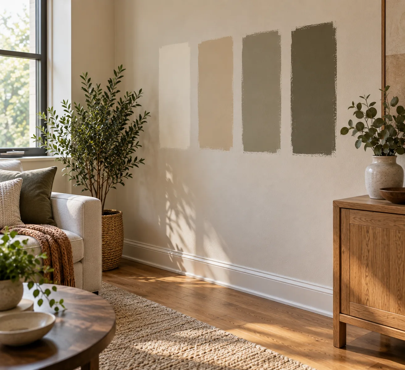
Paint a sample directly on the wall, not on a scrap of poster board propped against it — the wall's texture and the way light hits it at that specific spot both affect how the color reads. Look at it at three points in the day: morning, midday, and evening, since the color temperature of natural light shifts significantly and can change how warm or cool a color appears. A color that looks perfect at noon can look muddy or washed out by lamp light that evening.
For fabric and textile decisions, gather physical swatches rather than relying on product photos, and look at them next to your actual flooring and existing furniture, in your own room's light, before ordering anything at full size.
A Worked Example: Building a Palette Step by Step
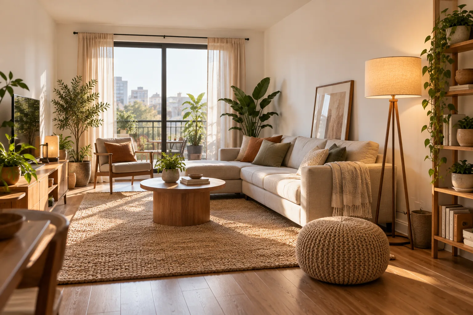
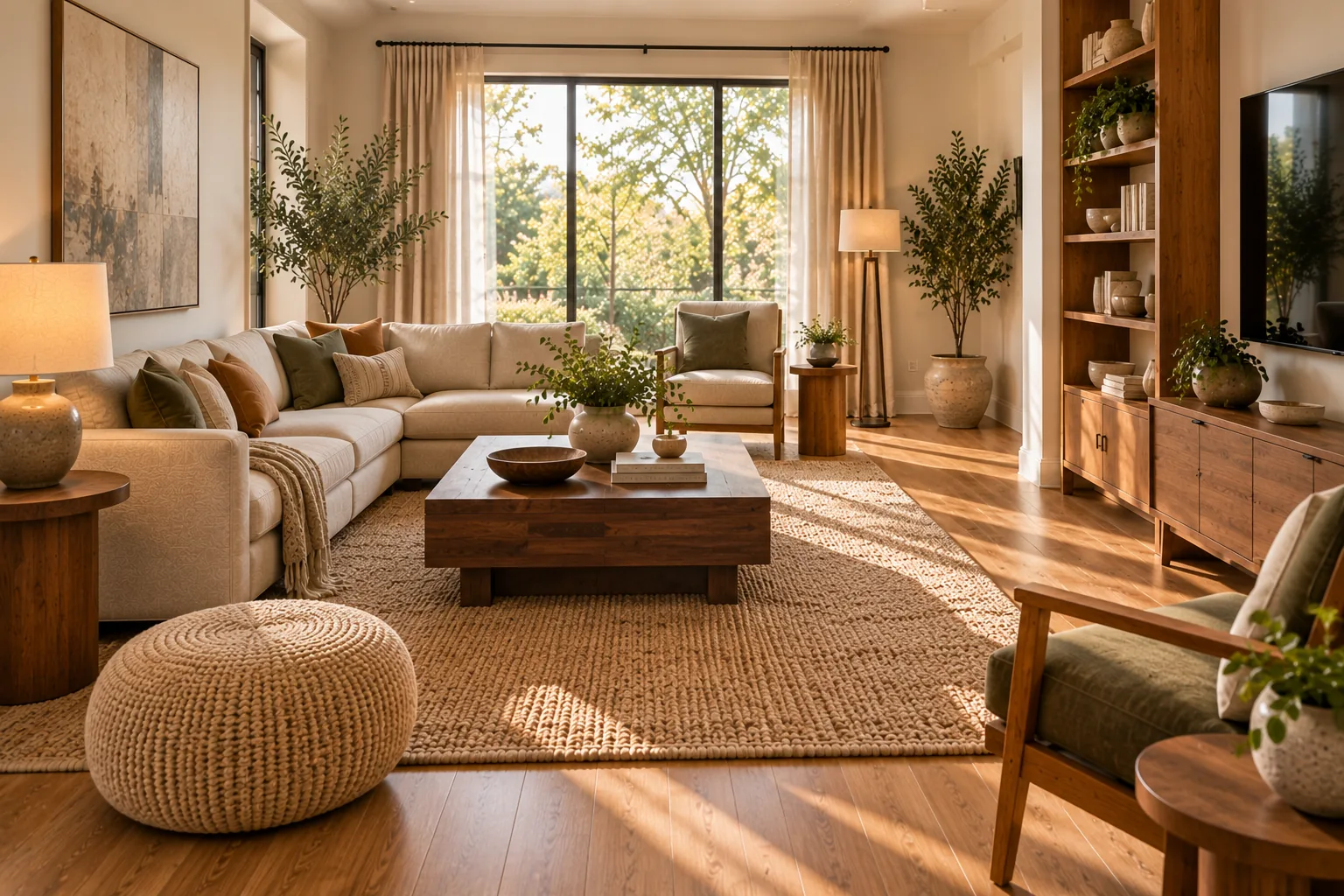
Start with a living room anchored by a medium warm-oak floor. That floor is warm-toned, so the dominant wall color should lean warm too — a warm white or soft greige rather than a cool, blue-grey neutral, even though both would be described as "neutral" on a paint chip. That warm neutral becomes the 60% dominant share, covering walls and, ideally, the largest furniture piece.
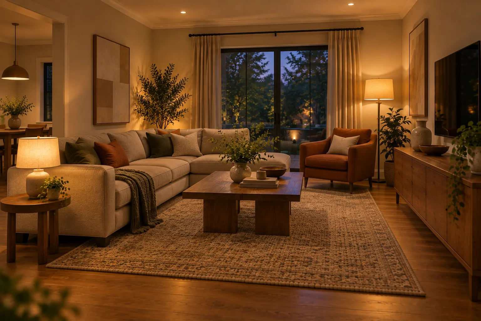
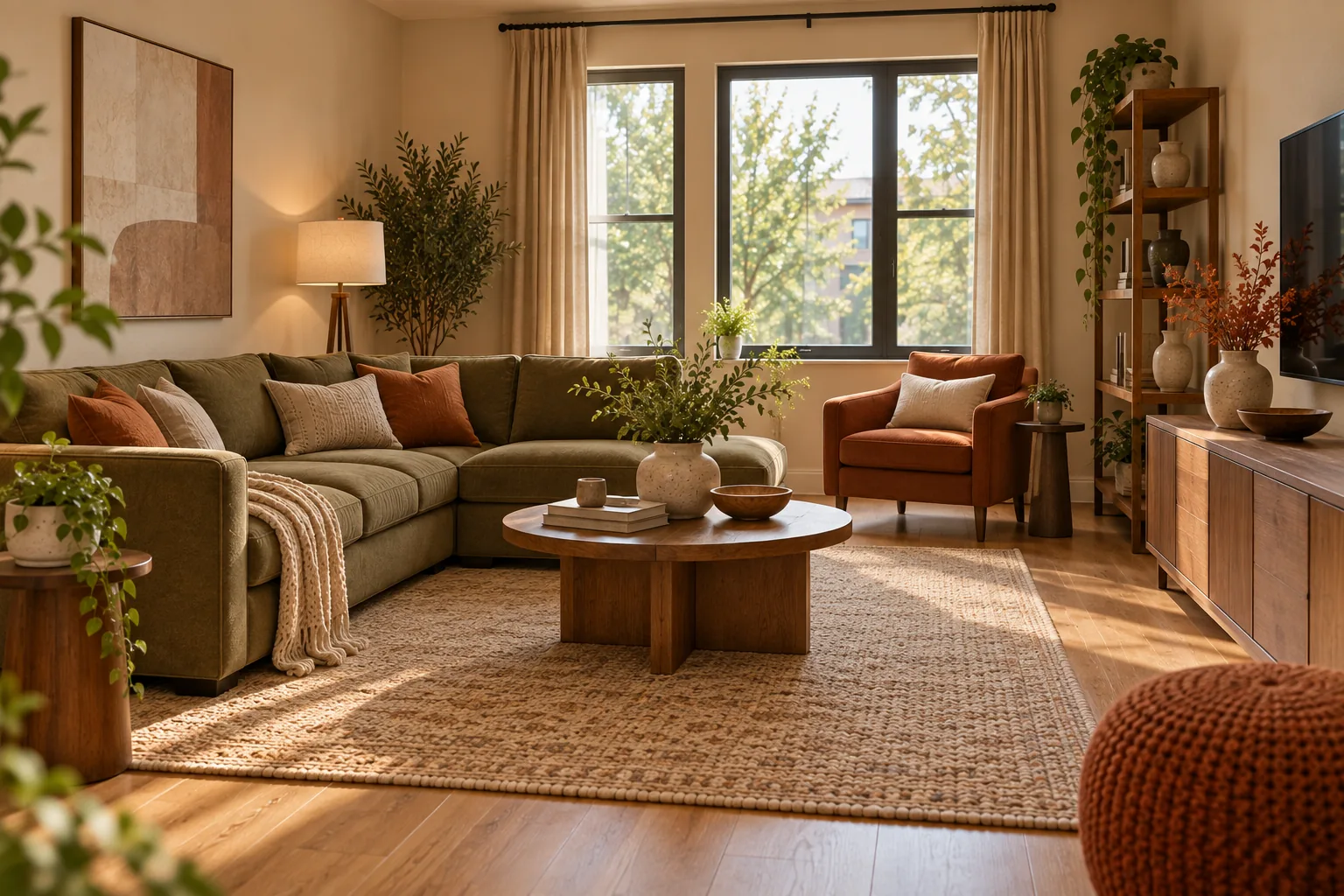
For the 30% secondary color, choose something with enough presence to read as a deliberate choice but still restrained — a deep olive or muted terracotta on a sofa or a pair of chairs works well against a warm neutral wall, in keeping with the same warm, natural-material approach covered in making a home feel warmer and more inviting. The remaining 10% accent gets the boldest color in the room: a rust or brass-toned accessory, a piece of art with a stronger color, or patterned pillows that pull in a fourth tone without giving it a large share of the room. Each step checks back against the anchor's warm undertone before moving to the next.
Neutral Doesn't Mean Colorless
A "neutral" palette is often assumed to mean beige, white, or grey used without much thought, but neutrals carry undertone just as strongly as bold colors do. A warm neutral palette and a cool neutral palette can look dramatically different sitting side by side, even though both would be described the same way in conversation. Treating neutral tones with the same undertone discipline as the rest of the palette — not as a default, thoughtless choice — is what separates a considered neutral room from a room that simply avoided color.
Refreshing a Palette Without Repainting
Once a dominant wall color is in place, the 10% accent share is the cheapest lever for seasonal or periodic change. Swapping accent pillows, a throw, or a piece of art shifts a room's feel without touching the larger, more expensive-to-change dominant and secondary shares. This is a useful thing to plan for from the start: choosing a dominant and secondary color that can comfortably host several different accent colors over time, rather than a system so specific that only one accent color will ever work with it.
Warm and Cool Palettes Work Differently
Every color, including neutrals, leans warm or cool. A "greige" wall paint can carry more yellow or more grey depending on the specific formulation, and that undertone determines what it pairs with well. This is the same underlying idea behind mixing wood tones without it looking chaotic — undertone consistency matters more than matching exact shades, whether you're coordinating paint, fabric, or furniture finishes.
Carrying One Palette Through Multiple Rooms
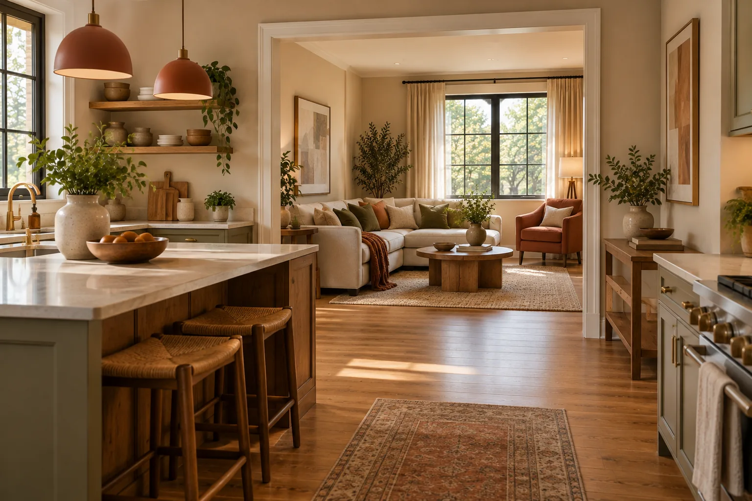
In an open-plan home, or simply a home where rooms are visible from one another, a palette that changes completely from room to room can make the whole space feel disconnected. This doesn't mean every room needs identical colors — it means keeping the same anchor undertone and a shared color family running through adjacent spaces, so that walking from the kitchen into the living room feels like a continuation, not a jump to a different palette entirely.
Real Examples
The Small Rental
Without permission to paint, the anchor becomes whatever's fixed and can't change — usually the flooring. Building a palette through textiles, art, and furniture around that fixed floor tone achieves the same coordinated effect as a painted anchor color would, just through movable pieces instead of permanent ones.
The Open-Plan Family Home
With a kitchen, dining and living area all visible from each other, the shared flooring or an open sightline usually dictates one consistent anchor undertone across all three spaces, with each individual zone allowed its own secondary and accent colors within that shared family.
The Traditional Home Embracing Bolder Color
A deeper, more saturated color palette can work as confidently as a neutral one, as long as the same 60-30-10 discipline applies. A dark, richly colored dominant wall paired with lighter secondary furniture and a restrained accent color reads as intentional; the same dark color used at equal weight to two or three other bold colors usually doesn't.
Common Mistakes
Mistake: Choosing color in isolation from what's already fixed in the room. Wall color decided before checking it against existing flooring, tile, or furniture you're keeping is one of the most common reasons a palette needs to be redone. Always check new choices against the anchor, not the other way around.
Mistake: Testing color on the wrong wall or at the wrong time of day. A sample tested only in bright midday light on a wall that gets mostly evening light will mislead you about how the color performs when the room is actually used.
Mistake: Treating every color as equally important. Without a 60-30-10 style hierarchy, even well-chosen colors compete with each other rather than working together.
Mistake: Ignoring the room's natural light orientation. North-facing rooms receive cooler, more indirect light and can make colors read cooler and slightly greyer than expected. South-facing rooms get warmer, more direct light that can intensify a color's saturation. The same paint color can look noticeably different in each.
Budget-Friendly Ways to Test and Commit
Sample-sized pots of paint cost a fraction of a full gallon and are the cheapest way to avoid an expensive repainting mistake. For textiles, ask for fabric swatches before ordering full-size pieces — most retailers offer them for free or a nominal fee, which is far less costly than returning a full order that doesn't match once it arrives.
A Simple Palette-Building Checklist
- What's your anchor — the fixed element you're building around?
- Have you identified a dominant, secondary, and accent color at roughly 60/30/10?
- Does your dominant color's undertone match your anchor's undertone?
- Have you tested the actual color, on the actual wall, at more than one time of day?
- If your home is open-plan, does the palette carry a consistent thread between visible rooms?
A System, Not a Favorite Color
A color palette that works isn't built from colors you individually love. It's built from an anchor, a clear hierarchy of how much of each color to use, and a consistent undertone running through every choice. Once that system is in place, almost any color preference can be made to work within it — which is really an extension of the same idea covered in the interior design principles that make a home feel more beautiful: repetition and proportion do more for a room than any single color choice ever could.
What's the easiest way to start choosing a color palette?
Identify your anchor first — the fixed, hardest-to-change element in the room, like flooring or a large rug — and choose every other color in relation to it, rather than starting with a wall color you simply like.
How many colors should a room's palette have?
Three is a reliable starting point: one dominant, one secondary, one accent, roughly following the 60-30-10 proportion. More colors are possible, but each additional one adds difficulty in keeping the room feeling coordinated.
Should I test paint colors on white poster board or directly on the wall?
Directly on the wall. The wall's texture and the specific light hitting that exact spot both affect how a color reads, and poster board testing doesn't account for either.
Can a rental have a coordinated color palette without painting?
Yes. Treat the existing flooring as your fixed anchor and build the dominant, secondary and accent colors through textiles, art and furniture instead of paint.
Does room lighting direction really affect how a color looks?
Yes. North-facing rooms get cooler, more indirect light that can make colors read cooler and greyer; south-facing rooms get warmer, more direct light that intensifies saturation. The same color can look different in each.